Lafarmacia. is a pharmaceutical holding company, which aims to transform the Italian idea of pharmacies from a simple place of care to a complete wellness hub. During my experience with Wunderman Thompson I was part of the team in charge of redesign their digital touchpoints to make them more aligned to their vision and brand identity.
The project was a complete redesign of Lafarmacia's digital channels, and the goal was to deliver a full design system together with the design of some main pages. My involvement started during the personas' definition phase, which were useful in defining multiple customer journeys in order to then prioritize with the client the role and functionalities of the site. The heart of the project, however, was definitely the UX and UI sprints, where weekly we would first propose navigation and wireframes of a section to the client, and then propose the UI the following week. During these sprints I was personally involved in both the development of the weekly navigation and Wireframes and the subsequent UI
Desk Research
User Journey definition
Use cases
Wireframing
UX & UI Design Sprints
Presentation to clients
As anticipated the UI Sprints allowed us to prototype some pages, which could represent a real-life example of the use of the design system. Finally, a navigation map of all the pages designed was delivered
The project was a complete redesign of Lafarmacia's digital channels, and the goal was to deliver a full design system together with the design of some main pages. My involvement started during the personas' definition phase, which were useful in defining multiple customer journeys in order to then prioritize with the client the role and functionalities of the site. The heart of the project, however, was definitely the UX and UI sprints, where weekly we would first propose navigation and wireframes of a section to the client, and then propose the UI the following week. During these sprints I was personally involved in both the development of the weekly navigation and Wireframes and the subsequent UI
Desk Research
User Journey definition
Use cases
Wireframing
UX & UI Design Sprints
Presentation to clients
The project was a complete redesign of Lafarmacia's digital channels, and the goal was to deliver a full design system together with the design of some main pages. My involvement started during the personas' definition phase, which were useful in defining multiple customer journeys in order to then prioritize with the client the role and functionalities of the site. The heart of the project, however, was definitely the UX and UI sprints, where weekly we would first propose navigation and wireframes of a section to the client, and then propose the UI the following week. During these sprints I was personally involved in both the development of the weekly navigation and Wireframes and the subsequent UI
Desk Research
User Journey definition
Use cases
Wireframing
UX & UI Design Sprints
Presentation to clients
Once I gathered insights and potential opportunities from desk research and user interviews, I also conducted some codesign sessions with some emerging Italian sustainable brands. These were a great opportunity to learn directly from the targeted users and also to ideate and finally test the b2b sharing service as a possible solving direction.
Flemusa aims at helping emerging brands to adopt sustainable practices right from the beginning. The service is articulated through two main channels, one physical and one digital. The Flemusa app, represents the digital channel and allows brands to share orders of resources and materials from a network of partner producers, while the Flemusa Local represents the physical channel, a place that represents a real co-working space where to exchange expertise with other users, test and see the products of partner producers and where to physically receive orders.
The Flemusa App is composed by three main sections: Discover, Profile and Chart. The app offers to users the convenience to place orders with their buying group, in order to be able to reach together the order volumes required by the producers, so that everyone can be individually able to order only the quantity they really need
The Flemusa Local is composed by a Discover area where users can find samples from the partner producers and a Workshop area where brands can experiment with materials or simply exchange experiences with other users. It is important to emphasize that it is right the membership to a certain Flemusa Local that will define the buying group in the app, in fact, this aspect connects brands that are geographically close, allowing to minimize the number of shipments and to valorize the local creativity
The project was a complete redesign of Lafarmacia's digital channels, and the goal was to deliver a full design system together with the design of some main pages. My involvement started during the personas' definition phase, which were useful in defining multiple customer journeys in order to then prioritize with the client the role and functionalities of the site. The heart of the project, however, was definitely the UX and UI sprints, where weekly we would first propose navigation and wireframes of a section to the client, and then propose the UI the following week. During these sprints I was personally involved in both the development of the weekly navigation and Wireframes and the subsequent UI
Desk Research
User Journey definition
Use cases
Wireframing
UX & UI Design Sprints
Presentation to clients
The use of Ciclope is not limited to the research, indeed the aim of Ciclope is also to facilitate meaningful interactions between employees. Specifically, the users can also pin, share or evaluate the documents and even contact directly the owner for further explanations.
The project was a complete redesign of Lafarmacia's digital channels, and the goal was to deliver a full design system together with the design of some main pages. My involvement started during the personas' definition phase, which were useful in defining multiple customer journeys in order to then prioritize with the client the role and functionalities of the site. The heart of the project, however, was definitely the UX and UI sprints, where weekly we would first propose navigation and wireframes of a section to the client, and then propose the UI the following week. During these sprints I was personally involved in both the development of the weekly navigation and Wireframes and the subsequent UI
Desk Research
User Journey definition
Use cases
Wireframing
UX & UI Design Sprints
Presentation to clients
During the process we had the opportunity to conduct multiple codesign sessions both with SDD organizers and members. This allowed us to challenge our assumptions and define the concept that would have fit best the community needs.
The project was a complete redesign of Lafarmacia's digital channels, and the goal was to deliver a full design system together with the design of some main pages. My involvement started during the personas' definition phase, which were useful in defining multiple customer journeys in order to then prioritize with the client the role and functionalities of the site. The heart of the project, however, was definitely the UX and UI sprints, where weekly we would first propose navigation and wireframes of a section to the client, and then propose the UI the following week. During these sprints I was personally involved in both the development of the weekly navigation and Wireframes and the subsequent UI
Desk Research
User Journey definition
Use cases
Wireframing
UX & UI Design Sprints
Presentation to clients
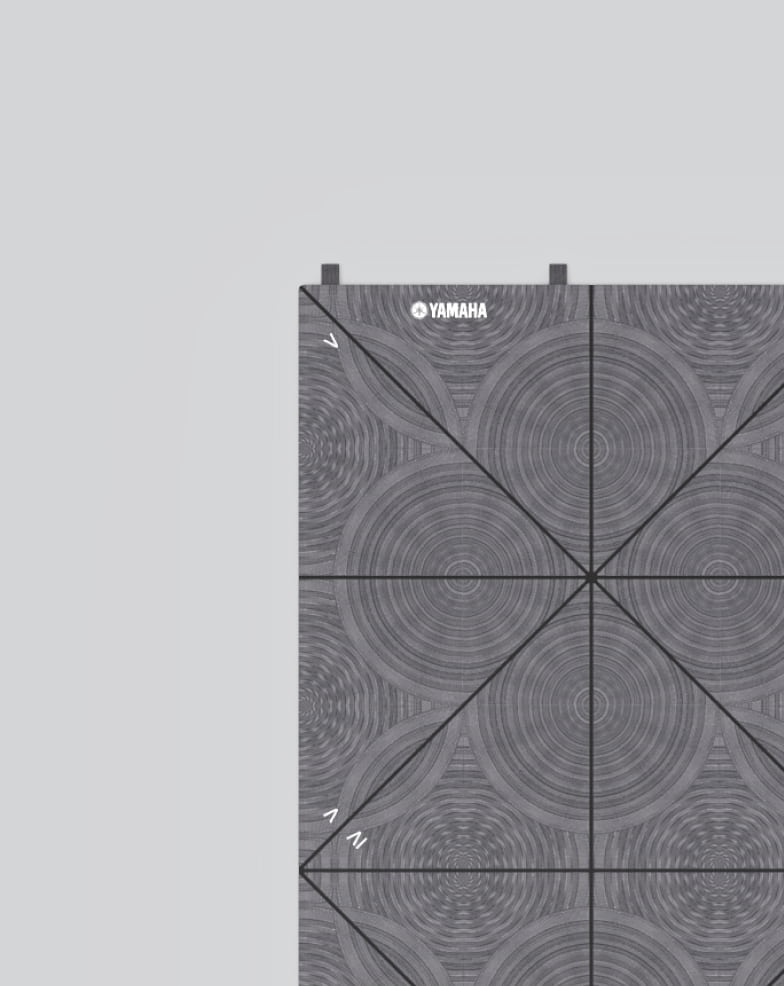
Its design consists of 24 triangular sectors, which allow the folding in a practical and transportable triangular shape. In addition, printed numbers suggest the steps to fold Mate